Pages

Monday, September 17, 2012

I'm ready for my close-up, Mr. DeMille!


Hi everyone:

I've recently been thinking that I seriously need to spend more time making friends with my camera. 

Photography isn't my forté, but since I'm the one who photographs my patterns, I need to be able to get good great shots to use on the pattern covers. You have to show the item that your customer will be making from the pattern, but you also want to how the pattern cover itself. You really don't want a buyer to think that they're actually getting a quilt for $8.00! 
This is where I need a great photo of the quilt project
I guess I feel like I'm wasting my time when I'm learning how to use things - cameras, software, iPads ... rather than actually making something. I should view this type of learning as an investment in my business, but it takes up so much time! It would be great to hire someone to take my photos and type up my designs, but that costs $$$ and when you're a little designer like me, that really cuts into your profit. So, I continue on with my limited knowledge and rely on on-line forums and friends' advice to help me out when I need it. 

My other concern with my photos is not just the images themselves, it's the styling of the shots. I've read all kinds of information about how to arrange your images and add props and what colour backgrounds to use and on and on. I find that most of this information deals with items that are being sold, such as clothing or jewellery, not much about patterns, so I'm doing some experimenting to see what works best with my projects. 

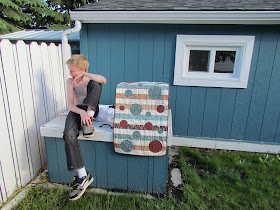
Recently, I decided to try some outdoor photography using our shed/playhouse as a background. I thought the rustic look of it would complement the table runner I was photographing. Here are some of these shots - untouched. 

Photographing "Bubbly Stripes" with
our playhouse as a backdrop
Shot #1
Photographing "Bubbly Stripes" with
our playhouse as a backdrop
A little further back with the window showing

Photographing "Bubbly Stripes" with
our playhouse as a backdrop
A little closer now, but still with the window in the shot
Photographing "Bubbly Stripes" with
our playhouse as a backdrop
Moving in a bit more, with a portion of the window showing
I like how the tablerunner shows up against the blue of the shed, the asymmetrical look of the shot, but don't think that the window adds much to the shot. I can crop this out in Photoshop (my photo helper), but still think that I need something else to really make this image pop.


Ah yes, this is just what's needed. Luckily, my "GQ model" son knew just what was needed and jumped in to help. I'm sure this will help to sell this pattern. Just need to decide which shot to use...

What do you like to see on a pattern cover? Just the project image or some styling? Let me know what you think.

No comments:

Post a Comment

Note: Only a member of this blog may post a comment.